Recently I’ve been working with start-up businesses, helping them identify and construct their company’s brand which included choosing fonts to represent their products or services. I also work with firms looking to change or expand their current corporate brand identity, looking to ensure potential customers recognise them.
Correctly building your brand is everything – it is the first association people create in their minds of your company. It is a positive reflection of your business, ethics and mission statement all rolled into one, and a symbol of what sets you apart from others in the same industry.
Be serious about your brand, keep it under lock and key and guard its originality – this is your company’s face in public, and you need it to be amazing.
There are many factors involved with creating an effective and memorable brand – to begin your journey in building your brand, let’s look at the importance of fonts and typefaces.
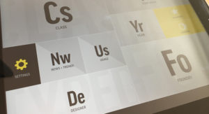
Type – How to choose a font to be a part of your brand
You might be wondering why I on earth I wish to discuss fonts and what’s so important about them. This is quite common, but think about it – every time you receive a marketing postcard, a newsletter, watch or read an advert – every single successful company selling themselves to you, regardless of their product, sells themselves to you in a consistent manner.
Unknowingly, each time you read their marketing bumph you are identifying with a very clever and considered brand identity, and this includes their fonts. Every word will be consistently written in a font that they use across the whole of their company.
That typeface, font, drops cap – whatever their choice of font design – will be the first blow from their marketing assault on your subconscious.
So strangely, the font is just as important as a logo or mission statement and most often, the first deliberation you should action when choosing your brand identity.
Choosing a font for your brand can sometimes feel like a bit of a stab in the dark if you do not share the same fascination for type as me. So if you’re not weirdly obsessive regarding fonts, how do you start to choose one, and what do you need to consider?
- Your brand. The font you choose says a huge amount about your services or product, so make sure the font reflects this. Never, ever, pick a font just ‘because you like it’.
- Your Target Market. Do some homework and analyse your target market and actively look at what fonts your competitors use. You can then pick a font that reflects and fits into your market, or choose one completely different because you think it will work and set you apart from your rivals.
- Test and Measure. Use friends, colleagues and contacts to test your type and the way it looks. Use them as your first gauge of whether this is the correct font for your brand identity and company. By all means ask questions such as: does the (only) font look nice? Can it be read? Or, would it influence you to buy my product?
But also ask the questions that really mean something, for example:
- Which font do you think represents the market?
- If you were buying the service or product, which company would you buy from?
- Which font gives you the right ‘emotion’ to buy?
- Is there anything, even if you can’t put your finger on it, which just doesn’t fit comfortably with any of the options? If so can you work out why?
- Choose complementary fonts. It may be that you want a bit of variety and/or you want the headlines to stand out from the main copy. This is not uncommon and can look very effective – but choose wisely and stick to your decision for everything that you write and create (the only exception I would mention, is emails).
- Choose the right weight of font. It’s no surprise that when you use the automatic styling in a word processing app it will give you a bold heading and a regular weight text. Centuries have proven that if you want to help your readers skim read or slow down, or to emphasise text, there are different ways to control readership through styling. A word of caution – too many different fonts are bad for plenty of reasons, but not least from a technical point of view on a website. Each font weight carries a file size and the more you use, the more requests your site makes, and therefore your site will slow down. Limit yourself to a maximum of 3 on a website and see if you can still emphasise your words.
- Be consistent. Use your font everywhere – in your logo, your leaflets, your website, proposals and presentations, any merchandising eg aprons, pens, memory sticks, balloons, banners. Absolutely anything you make or create, including internal emails and memos (your staff need to be completely on board with your brand), should have your font and typefaces being consistently used.
- Brand Style Guide. A style guide is a highly effective (and very simple) way to communicate to all staff, graphic designers, printers etc how you want fonts, sizes, weights, colours, paragraph structures to be used. Whenever someone new to your company starts, pass on the style guide and they will be able to effectively communicate within your brand identity. Simple!
It’s a funny thing how the little things can often make the big things even greater, and fonts are no different. Please don’t underestimate the importance of fonts and their role in creating you an effective and consistent brand identity. It may seem like an unimportant aspect, but trust me, Nike, McDonalds, Apple, Google, Coca Cola, Virgin etc etc didn’t.