Welcome to Typography Tuesday or Type Tuesday for short!
Every Tuesday, we’ll be exploring typography and the use of type in the modern-day language, delving into the various design nuances. Some of these you may know, while others may have been forgotten as we have evolved into the digital era.
Our design ethics are built on years old ‘typographic’ foundations. Type is everywhere, from magazine ads and tube posters to social media graphics. It drives visual communication, influencing how we connect and engage with what we are reading. In fact, we have worked in this industry for over thirty-five years, and we love type so much, we wanted to share some of our favourite ones. We hope you enjoy our top tips for tip-top typography!
Today we talk ‘Ligatures.’
‘Ligature’ comes from the Latin word ligatus, meaning to tie or bind, but the history extends as far back as the earliest forms of writing.
Designer Ben Casey from The Chase Creative Consultants shares his thoughts around typography as ‘the voice of the written word.’ However, he feels that there ‘comes a danger that the very foundations on which the subject was built could simply be forgotten.’
Typography – What is a ligature?
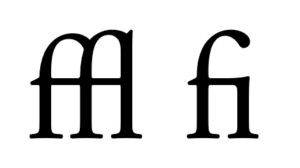
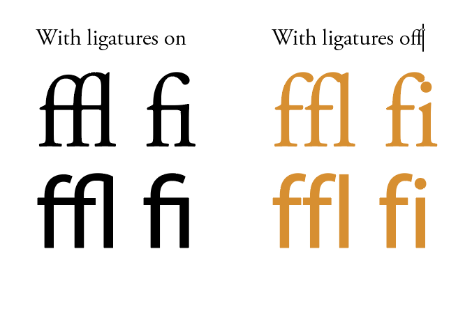
Casey describes a ligature as ‘two or three letters crafted into a single character.’
Typography – What are the most common ligatures?
‘f’ and ‘i’ and ‘f’ and ‘l’ are the most commonly used.
Typography – When do you use a ligature?
Sometimes in a text setting, the dot on a lowercase ‘i’ can clash with the terminal (overhanging curved upper branch) of the ‘f’. So wherever possible, you would use a ligature to avoid the clash. It’s the invisible skill that makes type easy to read.
We don’t whisper your story. We Scream Blue Murder.
A design and marketing communications agency.