What’s in a logo?
Logo design and branding part 2 – Designing your perfect business logo
In part one of our series on business logos and branding, we looked at the history of logo design through the ages. In modern times, logos have become iconic representations for some of the world’s most powerful brands. Think of golden arches. Can you see a certain global fast-food brand? And what about that apple with a bite taken out of it? Achieving this level of instant and universal recognition and recall is the holy grail of corporate branding – and it’s worth a fortune. BP reportedly spent £136m introducing its updated sunflower logo back in 2000.
Of course, not everyone can afford to invest even a fraction of that in developing their business logo. At least not to start with! But even without a massive budget, anyone can aspire to creating a memorable visual identity that does a great job of representing a brand and ultimately, communicating what that brand stands for.
What you do need is a great graphic designer: a talented individual you can work with, who ‘gets’ you and your business idea and can draw out your aspirations for your brand.
It helps if you can run ideas and associations past an independent focus group. But if this isn’t possible – and often it isn’t for a new or startup business – a lot can still be achieved by looking at your competition and enlisting the help of friends and colleagues to gather feedback.
“The soul cannot think without a picture” – Aristotle
Approaching the design of a business logo
When SBM started out, graphic design, including logo design, was at the very heart of what we did. So we have been asked, many times, “How do you design a business logo?” Our answer is always the same. We start by asking questions – a lot of questions – about the business. And you should too. Questions like:
- What does your business do?
- Who do you do it for – and where?
- If your business could only be remembered for one thing – what would that be? (OK, this is quite a tough one – but it certainly helps to focus the brief!)
Once you’ve really honed in on what your business is all about and who your customers are, it’s time to start looking at more personal preferences:
- Do you see the logo mainly as a visual, or lettering – or as a balance of both?
- Do you have a colour scheme in mind?
- Modern or traditional?
- Does it need to last in its initial form – or is it likely to evolve as the company grows? This is often tricky, but worth considering, especially if the company is likely to expand into distinctive new areas of business. Will you adapt the original logo or create a ‘brand’ new one?
The design of a new logo is often highly subjective – to begin with. But expect your designer to challenge you. That’s healthy – because very often, as a business owner or exec, it can be pretty difficult for you and your personal (design) preferences to step back and consider the impact your logo will have on your customers.
Who is your business logo for?
Your graphic designer will start by understanding what you have in mind, for sure. But in the end, your logo becomes less about you and more about your customers. As the creative process gets underway, it will help to really look at your business – and your new logo – from their point of view.
Clothing giant GAP found out the hard way just how important that is, when in 2010, the US reveal of their new ‘contemporised’ logo caused an outcry among customers. It took just one week for the company to do a complete U-turn and return to its original type-led logo.
Customers expressed great loyalty for GAP’s 20-year old logo
And GAP is far from alone. While BP has come under sustained fire for trying to associate its brand with clean, renewable energy (the rationale behind the sunflower), other major brands like BT, Tropicana and even the Conservative Party have fallen foul of public opinion with efforts to modernise their image through their logos.
BP’s redesigned logo quickly came under fire from conservationists around the world
Invariably, the lesson is a simple one. Be true to your brand – and take your customers with you. Whether you’re creating a new business logo, adapting or evolving a logo to reflect business growth or diversification or modernising a well-established brand, it makes sense not to alienate your customers and supporters in the process.
Getting started: designing your logo
However you approach it, designing your business logo is a big deal. As the device that your business and your brand will be built around, you want something you – and your future employees, if you’re planning on having any – can be proud of every day. Most of all, you’re aiming for something that your customers will recognise, love and feel great loyalty towards.
Which raises a very important point. Your logo and your brand are not the same thing. Inextricably linked, yes. But the same? No.
Your logo will become a cornerstone of your brand: an icon that people come to recognise as representative of your business.
But your brand will be built on what your business does and how it does it: its values, its performance and its attitude towards your customers. Knowing what those are and embedding them in the way your business works is what creates the positive (or negative!) associations that people have with your brand. And ultimately, it is the joining together of your logo and values in people’s minds that creates powerful, iconic, instantly recognisable brands.
Images or typography?
Whether you choose a purely visual business logo, a typographic one – or a combination of both visual and type elements – will depend largely on the vision you have for your brand and what you are trying to communicate.
For a tradesman, freelancer or independent financial adviser, for example, a type-led logo that focuses on the name of the business owner can work very well. After all, the reputation of the business is being built on the skills, performance and reliability of a named individual or perhaps as a family concern – and likely to be targeting business fairly locally.
A type-led logo can work well for businesses trading on the skills and reputations of their owners
Typographic logos are far from limited to peoples’ names – and yet done well, a name can become strongly and sustainably associated with positive values and associations. As one of the world’s most desirable brands, Virgin has diversified over five decades into travel, entertainment, banking, health and fitness and communications. For many, irrespective of which branch of the business we encounter, the Virgin name elicits an upbeat, positive response that is virtually synonymous with the man who created the brand in 1968.
Strong visual representation is all about helping your brand to stand out – and stay put in your customer’s memories. But very often, that powerful, iconic image that we become familiar with – think Nike’s ‘swish’ or Starbucks’ twin-tailed siren – started life with a typographic element to the overall logo. Over time, if we do a good job of communicating brand values, it is possible to simplify the logo even further, lose the typography – and still retain a business logo that is instantly recognisable and communicates a set of values and associations.
The importance of colour
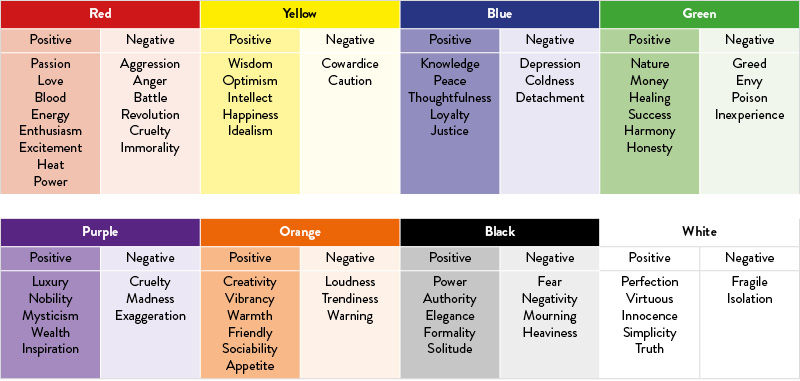
It’s very easy to be subjective about colour when designing a new logo – and some colours have relatively common associations for many people: blue, for example, as a colour strongly associated with ‘corporate’ and green, of course, as being eco-friendly. But according to science, the psychology of colour can have a powerful affect on our emotions and responses. And just to make life interesting – colours also have both positive and negative meanings.
Understanding the potential of colour to influence behaviour and shape our responses has long been a vital element of packaging and publishing. In highly competitive retail or newsstand environments, choosing the right colour for branding has a powerful impact in driving us to pick up one product over another.
Whatever colourway you and your designer choose, in the end this is one area where getting some feedback will definitely be worthwhile – and it doesn’t have to cost a fortune. Try some simple research among friends and colleagues to find out how people respond to your new logo in a variety of colours, while also making sure that it works at scale (both large and small) and ideally, that it can run mono and still have an impact.
Modern or traditional?
Deciding on a design style is something that, while you may have very strong ideas about it, should be guided primarily by really understanding who your customers are. Are they male or female – or both? How old are they? What interests do they have? What other brands appeal to them and why? How do they spend their time and money…? Creating your customer avatar/s should really help you to understand what will appeal – and a successful logo design will match this information to your aspirations for your business and your brand.
Even with all this information, it’s still a good idea to run ideas past a focus group, whether this is paid-for research or an exercise that engages friends, family and colleagues for feedback.
Think too about where you see your brand going in five to ten years’ time – and beyond. Is your aim to create a ‘timeless classic’? Or are you looking for a bold, contemporary approach?
Whichever route you choose, it’s not design for design’s sake, but a critical device that should reflect and support your brand ambitions – so make sure you don’t ignore your business plan when it comes to forming the design brief for your business logo.
Designing your perfect logo is just the beginning for building your brand. Next time, we’ll look at the importance of setting brand guidelines – and what it really takes to turn that logo into a brand.


