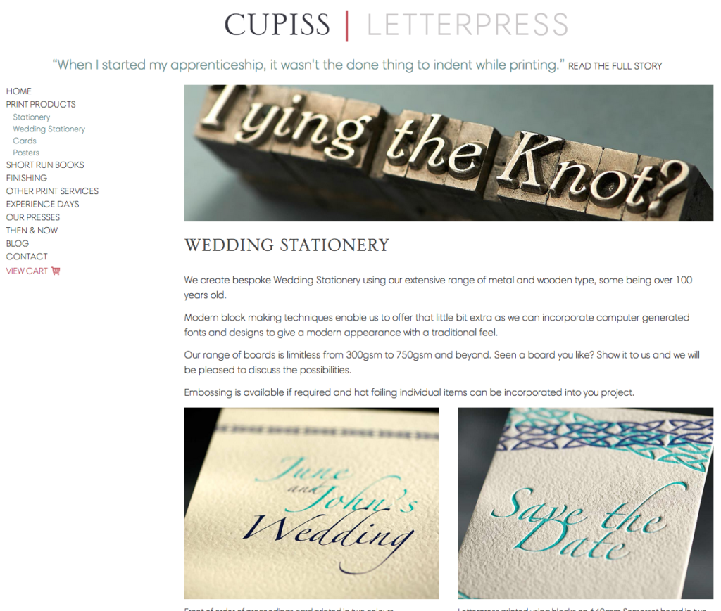
We have just launched a new website for Francis Cupiss Printers in Diss. The new site under the new domain, cupissletterpress.co.uk is a retina ready, fully responsive, modern site, featuring commissioned photography with a traditional twist.
The Brief
Francis Cupiss first started letterpress printing in 1830. John Harding is now at the helm (the 4th generation of his family to work there). John started as an apprentice, working under his grandfather and uncle and now works with Richard, who also maintains the print machines and has worked there for over 3 decades! John and Richard spoke to us about wanting to improve their website and bring their work to the modern day.
How do you bring 183 years up-to-date?
If you went to the print shop you would see that not much has changed over the years. They have their original Columbian Eagle Press still working away, next to the Heidelberg Printers (the hot metal press is in the corner, still functional but no longer in use!) and then to modern day copiers and then upstairs, where the modern digital computers join technology from the previous two centuries.
But to compete with the digital age and the recent return to interest in letterpress printing they needed to appeal to a more modern audience and this is where Scream Blue Murder came in.
Part of the brief from Cupiss was to work with local companies, so with that we teamed up with Rikki Tripp from Trippnology to program the site and Nick Read at Nick Read Photography to bring the print examples to life. Both were excited about being part of the project and aiding the next generation history of the Letterpress Printers.
The design needed to capture the traditional feel of the company, show examples of previous work with descriptions and explanations, all with a clean, modern feel. A carousel with a click-though to wedding stationery, experience days and short runs books being the main focus points.
An e-commerce area to sell cards, prints and posters is also included as part of the site.
Each page has a header photo using their composed type on various backgrounds, interesting in themselves. The photographs are all retina ready. The work examples have been shot in the studio with Nick using various backgrounds, compositions and lighting. Nick took the brief and focused on individual areas of the samples, with changing backgrounds and subtle lighting. Many considered photographs were taken and then using a lightbox and low resolution images we had to make the hard choice of choosing the final selection of images which required minimal retouching and cropping.
The site, programmed by Rikki, is created as a WordPress site, the content is fully editable by Cupiss. Using wireframes, online instant messaging and Bitbucket for keeping track of developing and the odd traditional telephone call and a couple of meetings, the site developed effortlessly through good communication. The site adapts to all platforms from mobiles upwards to a desktop computer where you can really appreciate the quality of the photographs.
John and Richard from Cupiss are really thrilled and love their new site, saying it is just what they wanted, that they have moved from the 19th Century to the 21st Century in style!
Visit cupissletterpress.co.uk and come back and let us know what you think! If you have a project that needs updating or starting from scratch, do give us a call on 01379 676720! We are a friendly, approachable bunch of people who are passionate about making our clients happy!
My thanks to Rikki and Nick for making the project fun and easy.
