Part 1 – The history of logo design and branding
In this 3-parter, we’ll look at how to design the perfect logo for your business and how to build your brand. But to kick off, we’re taking a brief look at the long and illustrious history of logo design and branding.
The use of logos has come under fire in some quarters – and fair enough. As a standalone device, the cost of developing a logo may seem unnecessary or even excessive, especially for a new business just starting out, when you can buy off-the-peg logos as easily as a chain store suit these days.
But then, the logo was never intended to work as a standalone device.
Building a memorable logo design and branding is about much, much more than a single visual.
Learning from the ancients
The logo – or logotype – to give it its full title, has been with us for thousands of years in one form or another. With the term derived from the Greek: λόγος or logos, meaning “word” and τύπος or typos meaning “imprint”, we can find the root of the modern logo in ancient times.
Ancient cultures: leaving their mark
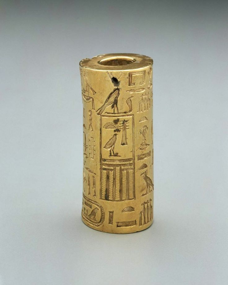
The ancient Egyptians’ used hieroglyphs not only to create individual cartouches to represent the names of their Pharaohs, Royals and Gods, but are known to have marked their ownership by branding their livestock using these pictorial devices too.
At the same time, around 3500BC, cylinder seals were used as a form of signature or administrative tool by the Mesopotamians. These highly stylised and individual devices were typically about one inch in length, engraved with written characters or figurative scenes – or both – and rolled into a two-dimensional surface such as wet clay to leave a distinctive and identifiable mark.
In this, they can be likened to other forms of impression seal, such as the stamp or finger ring seal that we see wielded many centuries later by Kings and Lords, to authenticate and seal important documents.
Symbolism as a mark of faith
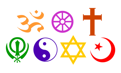
Perhaps some of the earliest and most distinctive forms of ‘logo’ are the symbols adopted by the world’s different faiths. From the cross of Christianity to Judaism’s Star of David, these powerful and enduring symbols represent their respective faiths and everything they stand for in a way that is easily, quickly and universally recognised. In this, these may be the truest representation of what we strive for in logo design and branding to this day: a simple, powerful symbol that immediately brings to mind a name and all the qualities and attributes associated with it.
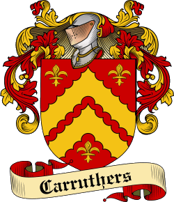
Insignia and heraldic devices: the coat of arms
While ancient tribes and cultures used insignia to identify their armies, it is with the evolution of heraldic design – the coat of arms – that we start to see individuals, families and even organisations use visual devices as a form of identification and a representation of their achievements.
Coats of arms are believed to have first appeared in the 12th century, when feudal lords and knights wore them on their shields going into battle. By the 13th century, these colourful and increasingly complex devices had become family emblems for some of Europe’s nobility, as well as spreading to non-nobles and the clergy, and as civil marks for towns, cities and universities. Interestingly many museums of medieval armoury suggest that coats of arms, as a means of identifying group formations, may be regarded as precursors to modern corporate logos.
The modern logo: first past the post?
How or why Stella Artois emerges as the first known device that we recognise today as a logo is a mystery, especially considering that the Belgian brewery appears to have been roughly 500 years ahead of the game. But according to design legend, the origins of this world-famous brand can be traced back to the founding of the Den Hoorn brewery in 1366. A local brewer, Sebastian Artois, bought the brewery and renamed it after himself in 1708, but the ‘Stella’ part, which means star in Latin, wasn’t added until the brewery released its first seasonal beer, Christmas Star, in 1926.
It was the red triangle of Burton-on-Trent’s Bass Brewery, however, that takes the prize for being the first logo to be trademarked in 1876.
![]()
Print, revolution & the modern logo
It is in the 18th and 19th centuries, with the industrial revolution, that we really start to see the emergence of visual devices that much more closely represent what we recognise as a logo today. With the development of photography and lithographic print processes contributing to the boom of the advertising industry, typography and imagery were being used together on the page. At the same time, typography was undergoing a transformation, with bold, flamboyant new styles of ornamental lettering – design-conscious typography – being developed for posters, books and other forms of print.
As print proliferated and became less expensive, so too did literacy – and commercial expression expanded to compete for the attention – and the budgets – of the growing middle classes.
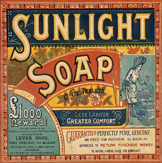
While the often opulent and some would say excessive Victorian decorative arts are credited with an expansion of typographic styles in the representation of businesses, it is the Arts and Crafts movement of the late 19th Century that is regarded as a watershed: a point when honest craftsmanship and quality came to the fore – and where artists and companies had a greater interest in taking ownership and identifying their work with distinctive marks.
Modernism and the rise of graphic design
With artists taking their place – and their credits – as designers in the Arts & Crafts movement, graphic design became a powerful tool on many levels – and especially in developing visual devices that could quickly communicate a company’s identity and values.
With the rise of modernism in the United States in the 1950s, Ludwig Mies van der Rohe’s ‘less is more’ ideology created a compelling and enduring tenet for good logo design and branding: visual simplicity and conceptual clarity, for an age that was seeing the rapid development of media channels – and with them, unprecedented opportunities for brand competition.
Next time: In the second part of this series on logo design, we’ll look at how graphic design – and graphic designers – become a powerful force in the creation of corporate logos and the building of iconic brands.