Customer: NJF Accounts
Website design for NJF Accounts – reflecting their brand personality
NJF Accounts, an established Norwich accounting company, approached us to design and build a new website that reflected their brand personality and attracted their ideal clients to their growing customer base.
Design Requirements
- A small, simple site that is easy to navigate, attracting potential new clients.
- One that effortlessly showcases our services along with testimonials from our customers.
- Professional, bright and a little quirky (like us!), reflecting our personality and brand palette.
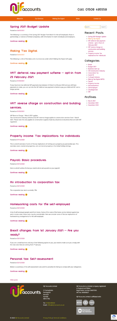
- Somewhere to house our articles and valuable accounting and finance news.
This was the brief from NJF Accounts. It was also their first website, as much of their business came from local referrals and advertising. As an established business, it was the right time for them to invest in a new website to enhance their digital footprint and raise the awareness of their brand online, locally, and nationally.
Content
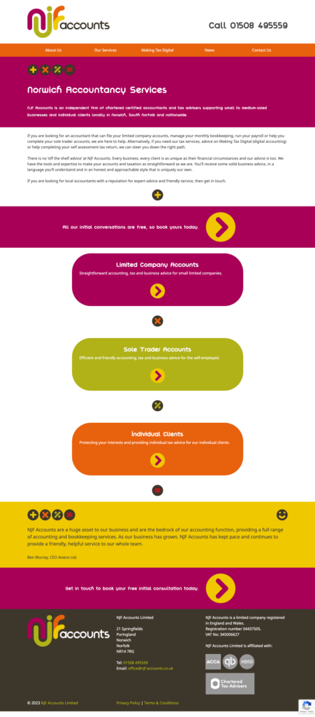
The outputs of a marketing workshop quickly defined the content for their three main client groups – limited companies, sole traders, and individual clients, with clear services and customer testimonials showcased for each. Then, different copy versions for the ‘Call to Action’ buttons pulled it together.
Website Design
We use atomic design as a methodology for creating our design systems throughout the build. This means that anyone can build a new page using the same elements we’ve designed. This made adding news articles to the site effortless and on-brand every time.
As with all design projects, we embrace what is available to create brand continuity across all media, so it started with the logo!
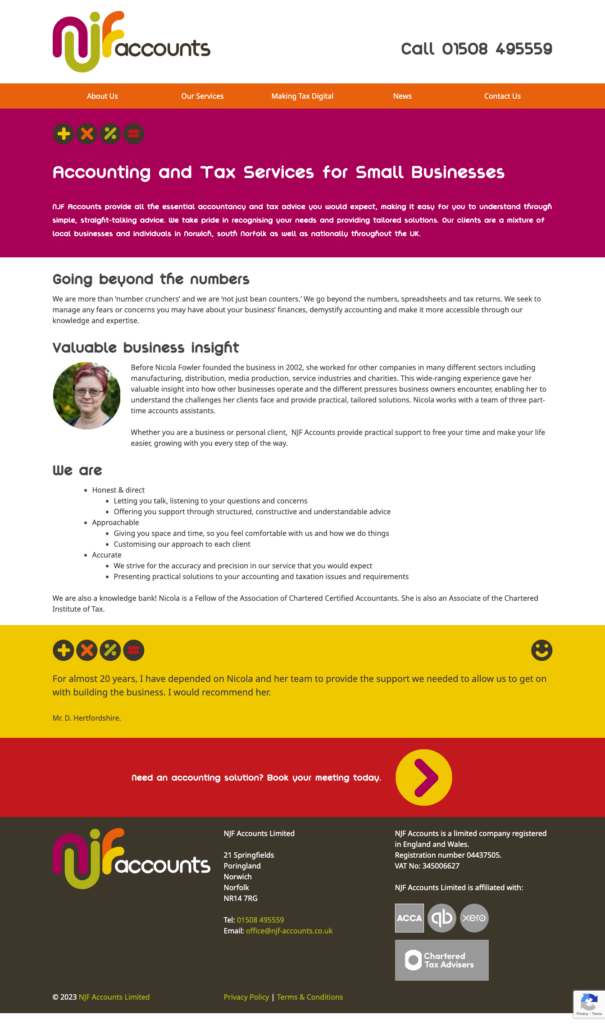
NJF Accounts already have a modern and colourful logo, and we used this to give us the colour palette for the design across the site, using the colours to create clean lines and navigable sections. In addition, we replicated the round fluid shape of the logo throughout. Finally, adding in the mathematical symbols (taken from the reverse of existing company stationery) completed the unique feel of this site.
Because of the use of graphic elements only, adding photos would not enhance the look and feel of the website. Instead, these visual elements were all that was needed to create a simple yet impactful looking site. Indeed, the ethos of NJF Accounts is ‘simple, straight-talking’ advice, and there was no need to move away from that.
When designing websites, we always think mobile-first, assessing how text and graphics stack or sit relative to each other. The fun part was working with the fluid responsive nature of these elements, adjusting the spacing to translate the mobile design into one for desktop.
The Results
‘We now have a simple, easy-to-use website that effortlessly showcases our services for limited companies, sole traders, and individual clients. It is easy to navigate, reflects who we are and is a great repository for all our articles! We are proud of our new website and our first foray into digital marketing – thank you, Scream Blue Murder.’


