Customer: The Psychology Clinic of East Anglia
Visit site: The Psychology Clinic of East Anglia website
In 2024, The Psychology Clinic of East Anglia (PCEA) approached us to design a new website to establish a strong digital presence and reflect their professionalism and expertise. Their goal was not a radical overhaul but an evolution of their brand that would resonate with a broader audience while maintaining the trust they had built over the years.
As an established and well-recognised clinic serving families and children throughout the UK, PCEA needed a brand identity that was warm, approachable, and engaging yet still professional.
The new brand identity also needed to resonate with the PCEA team and consultants, instilling a sense of pride in their online presence.
The Brief & Deliverables
PCEA required a comprehensive brand refresh, prioritising accessibility, digital-first adaptability, and flexibility. Our key deliverables included:
- An updated visual identity
- A refined logo
- A custom-designed font
- Graphics for the website
Key Considerations
Logo
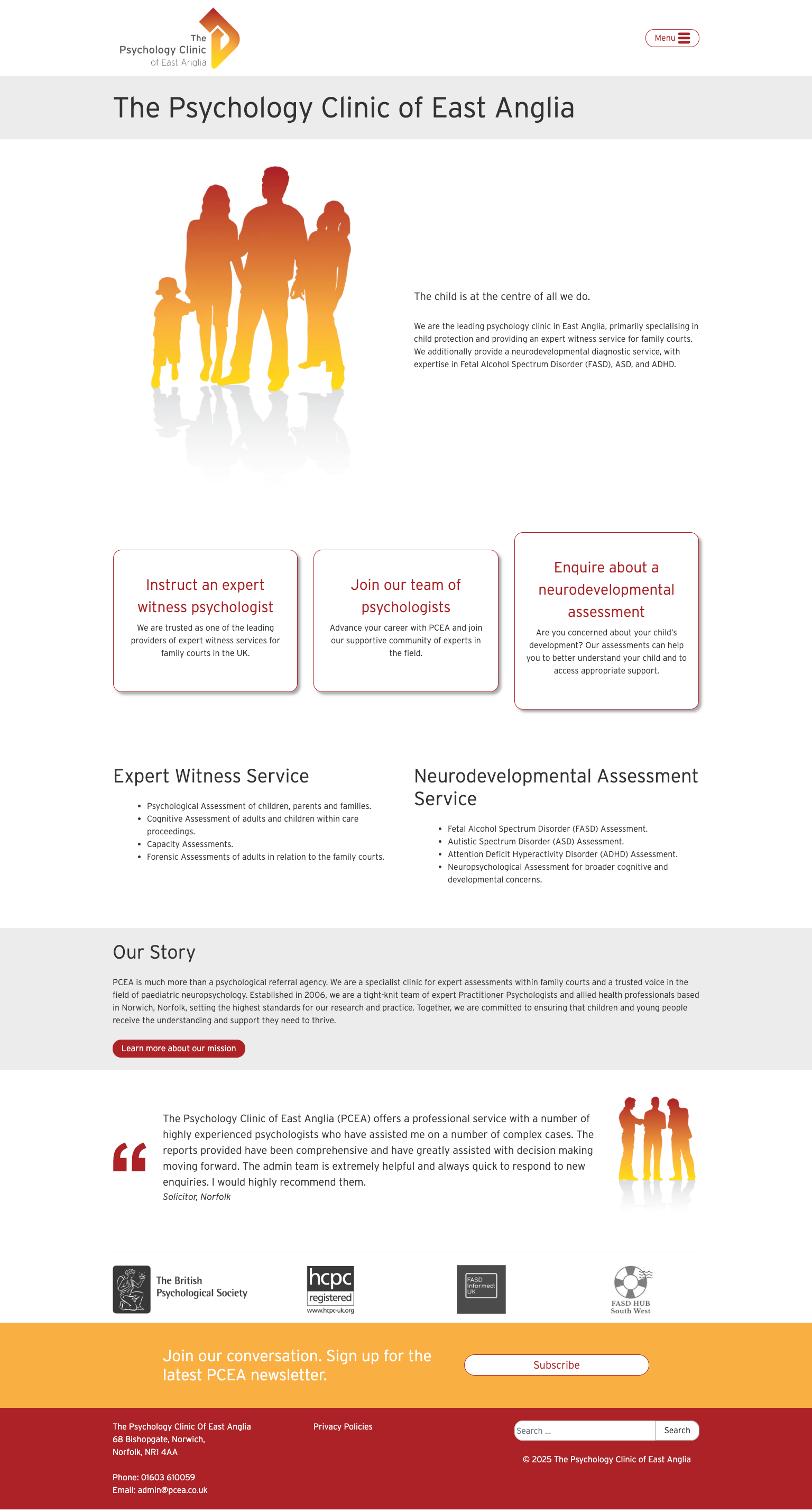
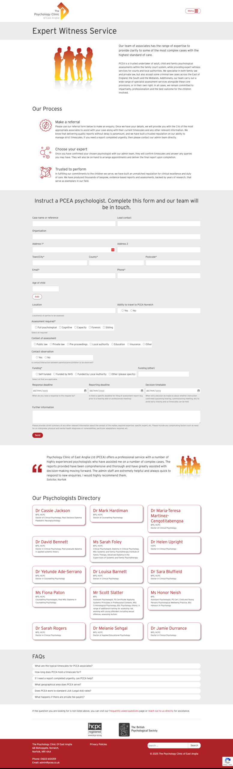
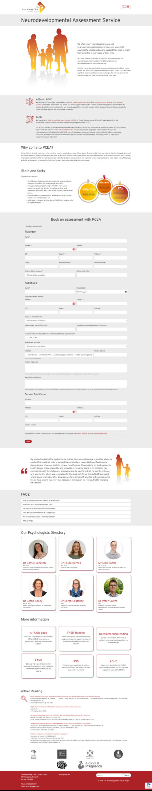
The logo was inspired by two key elements: the classic “thinking man” figure and East Anglia’s shape, symbolising PCEA’s regional coverage. We rounded off sharp edges and introduced a gradient of warm hues—shifting from orange to yellow—to convey empathy and approachability.
Imagery
A major challenge was ensuring the website’s imagery was inclusive and sensitive. The clinic did not have a library of professional images, and stock photography often failed to capture the nuanced nature of their work. We needed to strike a balance between visual representation and discretion, avoiding negative or exclusionary connotations.
The solution lay in the graduated tint used in the logo icon. This gradient effect allowed us to create silhouettes representing people, teams, families, and groups without revealing defining characteristics, striking a balance between inclusivity and anonymity.
Typography
The selected font was chosen for its clean, professional, and angular design, which complemented the geometric nature of the logo. Further refinements included adjustments to the angled slant on ascending characters, mirroring the “head” of the thinking man icon.
Colour Palette
The original branding showcased a solid red, which carried unintended connotations of danger and aggression. To soften the brand and introduce warmth and friendliness, we adjusted the colour scheme to incorporate a gradient of oranges and yellows. Additionally, we selected dark grey text to create a professional yet empathetic tone, reinforcing the balance between expertise and approachability.
Results
‘Working with Scream Blue Murder has been an absolute pleasure and a pivotal moment for us at PCEA. From our initial marketing workshop, they demonstrated their expertise and a genuine understanding of our business and the challenges we face. They helped us refine our messaging and zero in on our target audience, giving us the confidence and direction to move forward with purpose.
The icing on the cake was the website they built for us. It’s not just a website—it’s a true reflection of our brand, our values, and the professional image we want to portray. They captured the essence of who we are while ensuring the site is functional, user-friendly, and visually stunning. We’ve had so much positive feedback from clients and partners, and it’s already proving to be a powerful tool for growing our business.
Karin, Andrea and the team went above and beyond at every stage. Their process and communication were brilliant, making what could have been a daunting experience easy and enjoyable. If you’re looking for a team that can bring clarity to your marketing and deliver exceptional results, look no further. We couldn’t recommend them more highly.’
Dr Mark Hardiman & Dr Cassie Jackson- PCEA