Customer: The Medical Room
The Medical Room is a specialist recruitment and training company for the Medical Engineering sector. Scream Blue Murder started working with the company in 2010, following an introduction from another of our clients.
Initially we worked with existing materials to create adverts and presentations. Then in 2013, a revamp of the company’s specialist recruitment website prompted a new look at the logotype – and new thinking about how The Medical Room looked in its marketplace.
The result was the redevelopment of The Medical Room’s corporate identity, with a brief to retain recognisable elements but increase a sense of authority and credibility – and simplify the layout so that the logo was more comfortably situated in a range of materials, from graphics and advertising to presentations and training materials.
Keeping similar colour structures and The Medical Room’s instantly recognisable symbol, Scream Blue Murder looked for a more contemporary and distinctive font, that would lend greater authority while still feeling professional and relevant in the medical marketplace. The Rotis font family did exactly that, evolving The Medical Room’s logo into a sleeker, more authoritative statement that The Medical Room were really happy with.
Since then, Scream Blue Murder has continued to work with The Medical Room to update all the company’s internal documents and help to transform their training units into professional documents that students work from to gain their certifications.
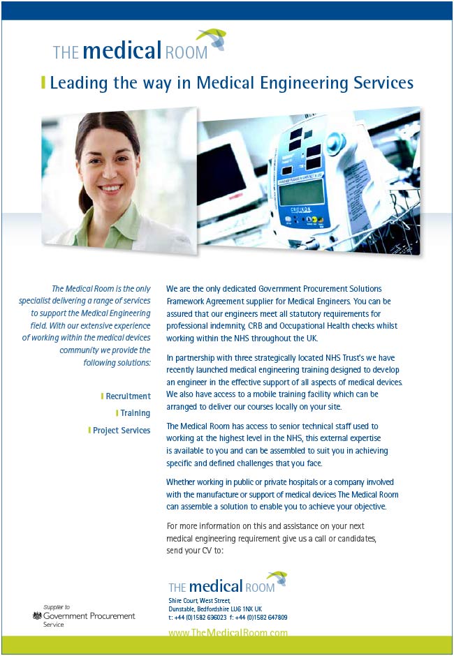
The new logo has also been incorporated into new designs for banners, exhibition graphics, stationery, company merchandise, from pens and polo shirts, to branded anaesthesia medical rules and USB memory sticks!
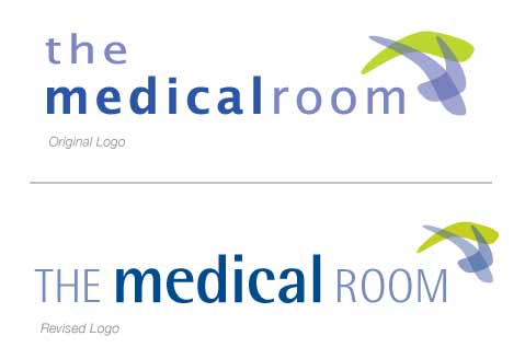
The Medical Room - Old and New Logos

Design of branded Polo shirts and pens for use at conferences and events