Customer: DisplayTek
DisplayTek specialises in backlit tensioned fabric display systems and LED displays. The units are unique in their simple, modular construction and using different types of tensioned fabric, these display, exhibition and retail stands do stand out in a crowd.
The company wanted its corporate identity to reflect their modular interlocking system – and when we met DisplayTek, their logo just didn’t do their product justice. So we set about trying to reflect their simple and truly modern concept.
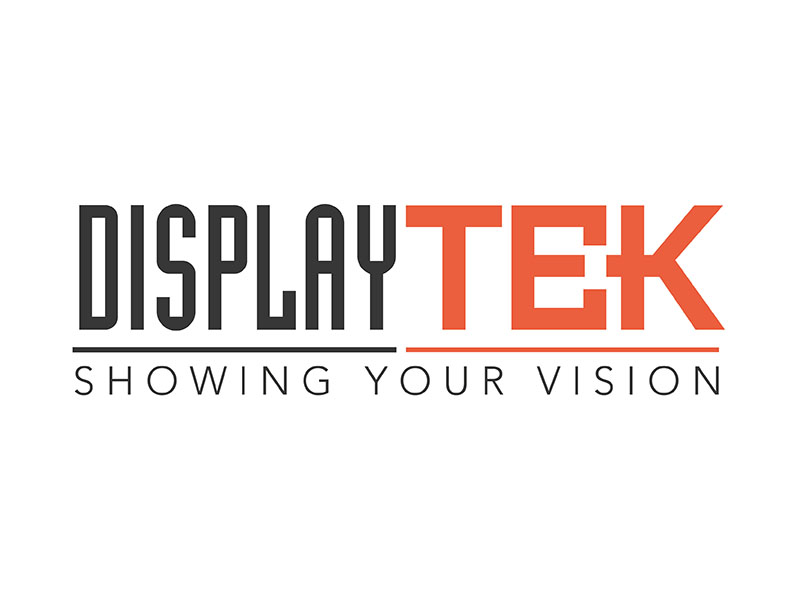
Using a modern display font, we played with the construction of the type and came up with a modular logo that was a simple reflection of DisplayTek’s solid, square locking system, using the square bars of the capital E and the middle bar of the letter K to represent a junction point at the centre of the two letters.
Richard and Carl of DisplayTek said that they felt their new logo was:
“Simple, effective and in keeping with our product. We feel the logo really represents who we are and what we offer our clients.”

