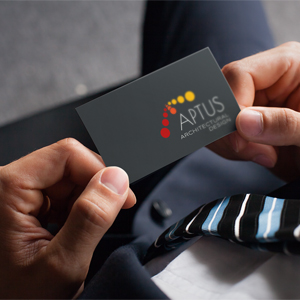
Customer: Aptus Architectural Deisgn
When Martin came to the office to discuss a logo he wanted, he was quite sure about the look and feel of how he wanted it to look. We listened to his thoughts and examples of what he liked and didn’t and gave us the blank canvas to be creative.
Part of our research into competitors, both large and small, showed many similarities within the industry to geometry and architectural illustrations. We came up with about 6-8 design which we discussed in-house first before deciding to show the client about 4 of them. Having said that we had answered his brief on all levels he went away to think about things and look at the design in a fresh light.
He came back with 2 that he just couldn’t decide between… it left him with quite a dilemma – which one to choose? When you are making a decision about a logo that is going to represent you, your company, your industry you, it can be a hard choice. Add to that you really want it to stand out and be different from competitors within the industry and also be able to see the logo in 5, 10 or 15 years time.
He took some time to deliberate, but eventually decided on the logo that most stood out, was not geometric in shape, but still had some geometric feel. It was tried in various formats from title blocks on architectural plans to business cards and stationery. Martin was sure that this was the one to represent him and the company.
Sometimes it is good to break away from the norm and follow your own path… if you would like something a little different from your competitors then we would love to hear more about it. Speak to us about your dreams and we can let our imagination help you realise your vision.