Customer: Norfolk Baskets
Visit site: Norfolk Baskets
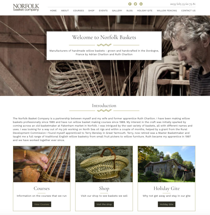
Norfolk Baskets needed a redesign of their old website. They didn’t have a huge budget but we were still able to create a professional, slick website that is fully customisable. They are thrilled with the results and have since had an order from America!
One of the first websites we ever designed and built was in 2010, for long time client of ours, Norfolk Baskets. We created their old website way back in the dark ages, when we used nested tables and spacer gifs! We have been maintaining their site ever since.
Norfolk Baskets’ recent move to France meant they had plenty of new content needing to be added to their website. So far, their old site had worked well for them, but it was starting to look a little dated and not attracting many new customers.
In terms of their future development and needs, we thought it would be in Norfolk Baskets’ best interest to revamp the look and feel of their site, rather than maintaining the original and just adding content.
A huge part of the brief was to expand upon the positive elements of their old website but make the new site responsive, easy for them to update without requiring our help, and maintain brand colours and imagery that had become part of their style (sepia images really suit this craft!).
Norfolk Baskets’ new website can be viewed on all devices and features fabulous recommendations. Even though they now reside in France, people can even find and shop from them in America! Voici la perfection!
Please view the screenshots for Norfolk Baskets below.
If you feel your website requires a redesign to shake off old content and start generating new leads; call us on 01379 676720 and find out how we can help.


