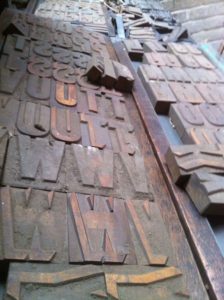
 Earlier this year, John and Richard uncovered some very old, dusty boxes in the attic at The Wilderness that turned out to be full of what appear to be headline letterpress fonts of the hand cut variety.
We have no idea how old these fonts are, although we have deduced that they may be from around the mid 1800s, which would tie in with Cupiss Letterpress’ move to The Wilderness… and may mean that the hand cut blocks are even older than that!
It would be amazing to find someone – a ‘Sherlock-type’ (see what I did there!) – that could help us identify the typefaces, or at least help us to understand exactly how old they might be. There are six or seven in all, so if this is your forte, please get in touch.
Meanwhile, we’re all very excited about the series of posters we’re creating on the Heidelberg 10 x 15 Press (1950).
The first, which we’re calling ‘Captain of my Destiny’, has been printed using the hand cut shadow font and is so named because the poster features the Nelson Mandela quote “I am the master of my fate and the captain of my destiny”
The posters will be available soon and we hope to raise funds for the fight against Ebola with the 1st of 100 prints, framed and mounted, going to auction – feels like a good, right thing to do!